The purpose of a video game cover is fairly simple: to give players an idea of what the game is all about. And if players like what they see, they’ll scoop the game up and start playing right away.
Every now and then, though, the art department and the programmers don’t see eye to eye. This results in misleading game covers that look nothing like the actual game!
There have been plenty of offenders over the years, but these are the absolute worst.
Tetris

Every gamer has played their fair share of Tetris. But the cover to the original game has almost nothing to do with the actual gameplay!
Instead of featuring the iconic falling blocks, the cover simply features Moscow’s St. Basil’s Cathedral.
Sure, this hearkens back to the game’s Russian roots, but it makes about as much sense as a Super Mario Bros. cover that simply shows us Japan’s Mount Fuji!
Phalanx

Phalanx is a 1991 space shooting game, and a pretty fun one at that. But you might never know that by looking at this insane cover!
Instead of featuring outer space, cool spaceships, or epic interstellar fights, we have… an old man playing a banjo.
Sure, there is a tiny glimpse of a spaceship and a tagline that hints about the gameplay, but this old farmer is nowhere to be found in the actual game.
Pac-Man

We all know what Pac-Man looks like. However, after seeing this horrifying Atari cover, you may never look at this iconic character in the same way!
Horrifically, Pac-Man has arms and legs, and he looks like a gangly middle schooler who just put his gym outfit on. And he’s running from ghosts in a castle (not a maze), all while eating pucks (not pellets) until they look like his face.
This isn’t just a misleading cover. It’s a gateway to madness that would have made H.P. Lovecraft proud!
Mega Man

In some ways, the original Mega Man game is the worst offender when it comes to misleading covers. In fact, the longer you look at this cover, the more errors you’ll find!
First, the colors are wrong: Mega Man inexplicably has a lot of yellow on his iconic blue outfit. And he looks too old — the robotic child of the game looks like a grumpy, middle-aged man on the cover.
Weirdest of all, he is carrying a gun… a bizarre choice for a character with a giant cannon built directly into his arm!
Breakout

If you go back far enough in gaming history, you can see the struggle that designers were going through. Specifically, they had to find a way to convey what the game was all about to a world that didn’t really know what video games were all about.
And that’s the case with Breakout for the Atari 2600. If you’ve never played the game, Breakout is like a very basic version of Arkanoid.
The cover, however, shows two men playing Tennis. While that would have been a good metaphorical representation of something like Pong, it makes no damn sense for Breakout!
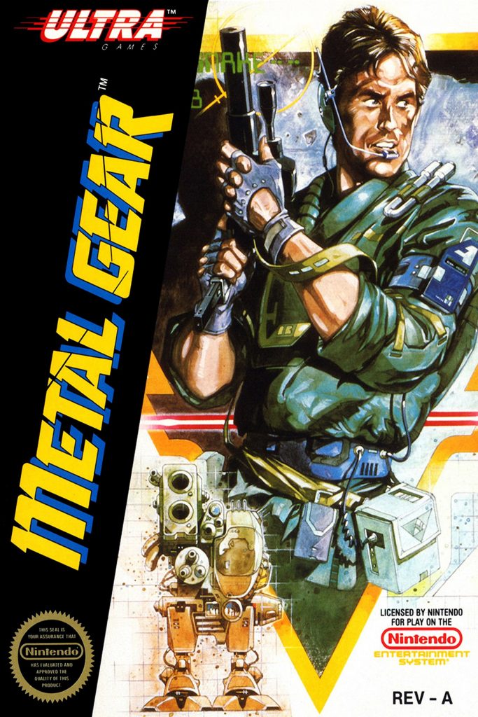
Metal Gear

It was Pablo Picasso himself that said, “Lesser artists borrow; great artists steal.” And Konami must have been big Picasso fans, because they certainly knew how to steal ideas for their covers!
Metal Gear is arguably the worst offender. You could argue that this cool portrayal of action hero Snake isn’t that misleading regarding the actual gameplay.
But look closer: that’s Kyle Reese from the first Terminator movie! Unless “Metal Gear” is code for the T-800, this rip-off cover is seriously misleading to gamers.
Bust-A-Move 2: Arcade Edition

All of the covers on this list are misleading because they don’t represent actual gameplay. However, some games slide right past “misleading” and into the territory of “utterly insane.” And that’s the case with the cover for Bust-A-Move 2: Arcade Edition.
In the actual game, you take control of the cutesy dinosaurs from Bubble Bobble and try to fire colored balls into the top of the stage as it descends. By matching the right colors to the colored balls at the top of the stage, you can make them disappear before it’s too late.
Instead of the cover featuring the cute dinosaurs or brightly colored balls, we get a cover of screaming balls with their eyes forced open. They look like a freakish combination of Darth Vader without a mask and Alex from A Clockwork Orange.
Good luck getting to sleep after seeing this!
Forsaken 64

Nobody really remembers Forsaken 64. That’s because it was a middling shooter on the Nintendo 64 released in 1998. Gameplay was bad at the time, and the graphics look even worse than you’d expect after all these years.
Maybe that’s why Nintendo went with this cover instead of showing us anything related to the game.
To be clear, this woman with the gaudy “Forsaken” tattoo on her cheek appears nowhere in the actual game.
And while “sex sells” and all, this is probably the most inexplicable cover choice since Phalanx gave us an old farmer instead of a cool space battle.
Which do you think is the worst offender? Did you ever buy a video game back in the day because of a misleading cover? Tell us in the comments below!
Category: Articles, Game consoles


